This is a follow-up from the Color Psychology and How it Affects Your Site article. Using color on your site is a great way to show individuality and creativity, however too much color can have a negative or unwanted effect.
In this article I will cover color theory, harmony and basic rules on how to use color. Â It is important to understand how different colors work together to create harmonies so you can choose a good color theme for your site.
What is Color Theory and Harmony?
Color Theory:Â is developing aesthetically pleasing color relationships.
Color Harmony:Â is a successful color relationship that can be applied to an infinite number of color combinations.
Basic Color Theory
The following section will give a quick overview of basic color theory.
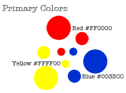
Primary Colors
The primary colors are:
- Red
- Blue
- Yellow
Secondary ColorsÂ
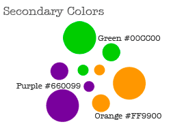
Secondary colors are created when two primary colors are mixed together (creating a new color).
The secondary colors are:
- Purple/Violet (Red + Blue)
- Orange (Red + Yellow)
- Green (Blue + Yellow)
Tertiary Colors
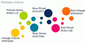
Tertiary colors are created when one of the following happens:
- One primary and one secondary color are mixed together.
- Two secondary color are mixed together
The tertiary colors are:
- Red-Orange
- Yellow-Orange
- Yellow-Green
- Blue-Green
- Blue-Violet/Purple
- Red-Violet/Purple
Color Harmonies
Color harmonies consist of similar hues or contrasting ones that are soothing to the eye.
Color harmonies are usually subjective to personal preference; however there are some guiding principles that help make effective decisions about color usage.
A color by itself can elicit an emotional and physical response. The nature of this response can be altered by placing it in context with one or more colors. Perception of a color shifts dynamically when aligned with other colors.
You can vary color combinations to product color relationships (harmonies) that are allied or contrasting and therefore can affect the viewer’s impression.
Color HarmoniesÂ
- Complementary
- Split Complementary
- Double Complementary
- Analogous
- Triadic
- Monochromatic
Complementary: These are color pairs that are directly opposite to each other. These harmonies represent the most contrasting relationships. Using complementary colors cause a visual vibration and will engage the eye.
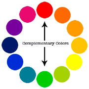
Example of complementary color schemes for your website:


Split Complementary: A split complementary is three colors (one color accompanied by 2 other) that are equally spaced from the first color’s complement. This harmony tones down the harsh contrast of a complementary harmony, providing a more sophisticated relationship.
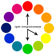
Example of  split complementary color schemes for your website:

Double Complementary: The combination of two pairs of complementary. When using a double complementary harmony, avoid using equal amounts of all four colors (use one color as the main color and accent with the other 3 colors). This will make the scheme less jarring.
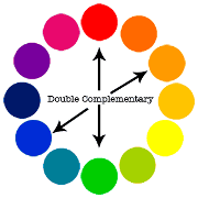
Example of  double complementary color schemes for your website:

Analogous: These are combinations (two or more colors) that are equally spaced from each other on the color wheel. These colors in a analogous harmony have similar light wave lengths (so they are easier on the eye).
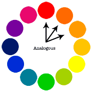
Example of  analogous color schemes for your website:

Triadic: Triadic harmonies are combinations of any three colors that are spaced evenly around the color wheel. This is one of the most commonly used color harmonies. Triadic harmonies work best when using secondary and tertiary colors, primary colors can result in gaudy relationships. A triad with two colors that share a common primary (example: Green and purple share blue.) can produce a more pleasing result.
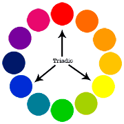
Example of  triadic color schemes for your website:


Monochromatic: These color schemes are made up of  shades and tints of one color (Example: Green). Monochromatic schemes use one hue and a variety of saturations and lightness to form a relationship of similar colors. Monochromatic color schemes work well for website design.
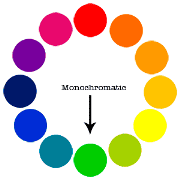
Example of  monochromatic color schemes for your website:


Color Tools (Resources)
Here are some great color tools and resources to help you color scheme.
Color Wheel: Anyone working with color should have a good color wheel. There are many different versions of the color wheel (including both digital and physical). I believe the most useful one is the twelve – step color wheel. (Add color wheel graphic download).
Websites: There are many color websites however I personally use and recommend the following (these are also great for color inspiration).
Desktop Applications: There are many desktop application for color management and scheming. I personally like to use software from Pantone (industry leader in color management).
- Colormunki
- Pantone Color Manager Software
Now that you understand a little more about how colors work together, you can play around with the color combination of your site’s theme and make it even more appealing.
Super tips on Wed Design, I have found through my own trials that colors due matter. Black on white will really be a down fall for any site design. Seen readers drift away very quickly. Colors due matter, your ad placements should also try to match your site design. Thanks for the great read and tips.
Whenever we design a WordPress theme we should always try to use the base colors well. Playing with shades sometimes produce unwanted results. I think this article highlights the importance of color concepts that every designer should have.
Color palletes are a great way to choose color and mainly should be based on the logo , some websites like colorcombos provides good color combos and matches
@Peter, This is a great way to keep color themes simple yet still enjoyable. A couple of colors that work well together with shade variations or neutrals (white, black, gray) added in to fill the gaps is a great way to go.
Colour theory is quite a difficult and subjective area. I don’t claim to be a UI/X developer but I try and stick to one to three base colours and throw in some shades